Summary
Schwab’s product team was methodically converting legacy (non-responsive) pages to ones that would show up equally well in desktop, tablet, and mobile.
Problem
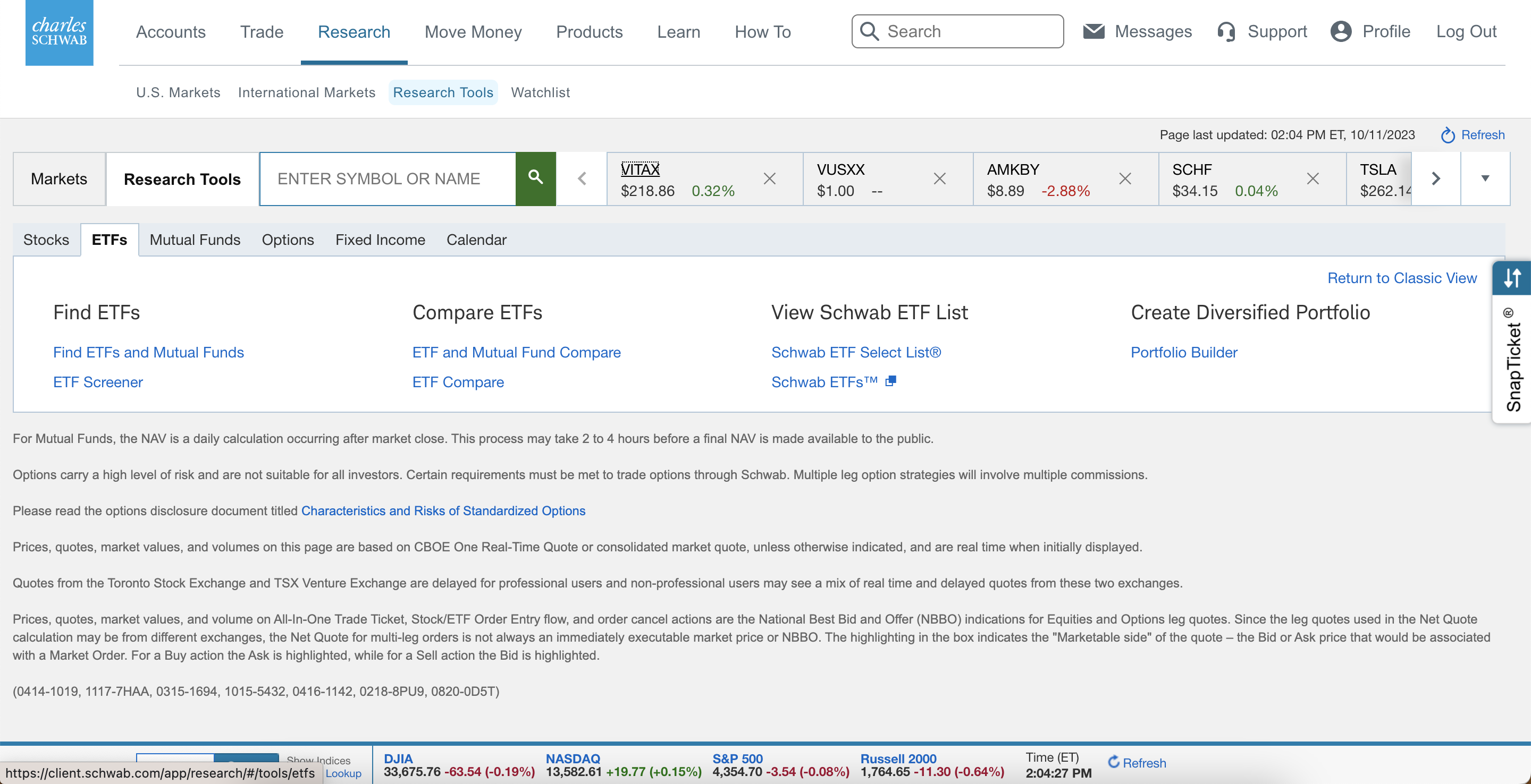
Product noticed that various sections of the authenticated (logged-in) offering had minimal engagement. One in particular was the research section, where clients could utilize various tools as a self-service offering. The tools were working, but it was unclear what the text links on the Tools page referred to specifically.
Solution
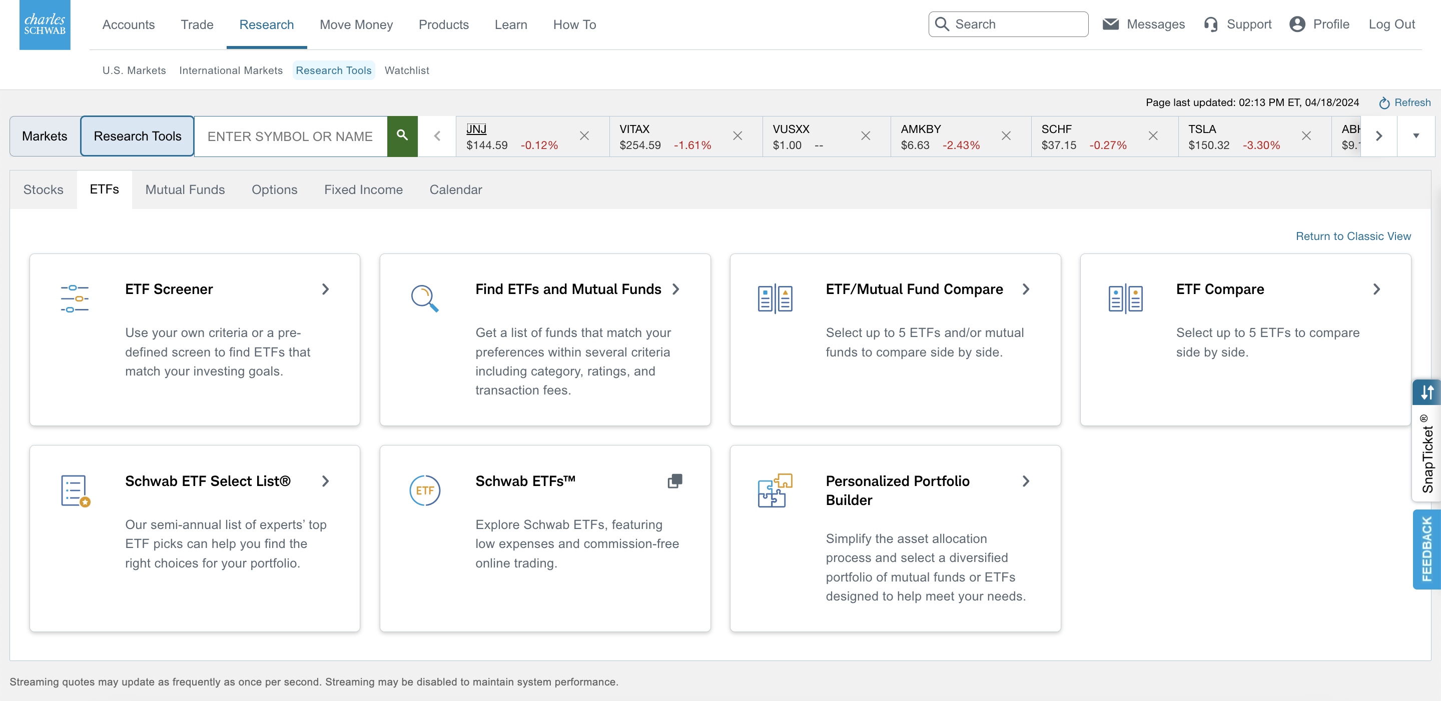
The design team looked at the issue, looked at our design system, and offered three possible layouts. After looking at them with the product team, they picked the card view. This option also allows for iconography, and descriptions to better relay to our clients what they might be able to accomplish by navigating to the corresponding section. By applying the new designs, we also made the tools responsive, so clients could view in any viewport (desktop, tablet and mobile) and increased engagement over 20% from the previous design.
Research Tools (Requires a Schwab account to view)

