Summary
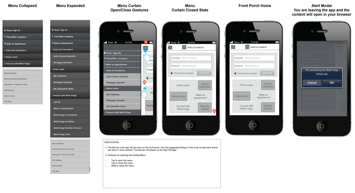
Wells Fargo Bank had a mobile app they wanted to update from late 2000. The original app was in hybrid/ non-native code (wrapper). The stakeholders wanted to apply an updated look and feel to the non-authenticated (not logged in) experience for our 17M active, mobile app users.
Problem
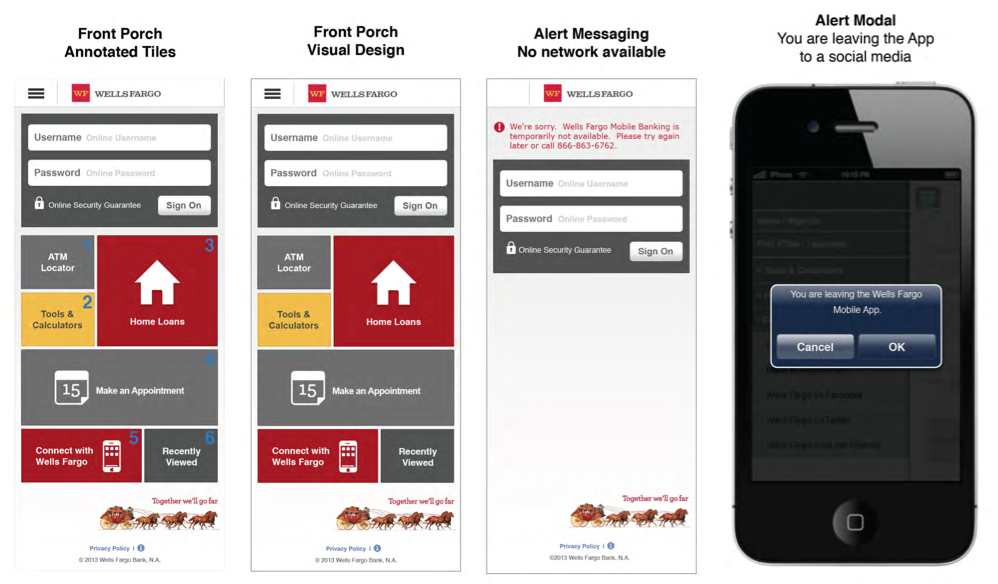
The former app only allowed for login, ATM finder, and other limited offerings. The marketing team wanted to be able to serve offers on the home screen of the app, and offer space to departments such as loans, lines of credit, accounts, and insurance, on the home screen of the app. This offered a particular challenge: How do you allow, potentially all the bank offerings to appear on the app home screen?
Solution
UX and visual designed a fully responsive solution (the app remained hybrid, and can be viewed in landscape or portrait), with a tile system which allowed teams (loans, lines, accounts, insurance) to offer a “Tile” to their products and service. The tile system was first recommended by UX and engineering based loosely on MTV’s current (at the time) app home.

