Summary
This was the redesign of Mulesoft’s Solutions page for their Anypoint Platform™.
Problem
The existing page used iconography which didn’t clearly capture what the Solution was, and only the links were “linked”, not the actual icon. The team wanted to come up with a cleaner way to get users to what they were looking for.
Solution
We tested a few designs based on the competitive analysis, using cards and tiles, however the winner was an in-house design which was 100% link based. Live visuals from the initial release can be seen in the header of this page, and current versions can be compared from the link below.
Website
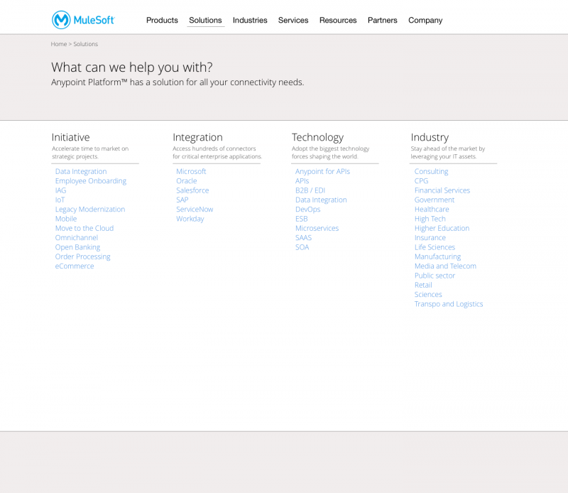
Mulesoft Solutions Page (desktop wireframe)
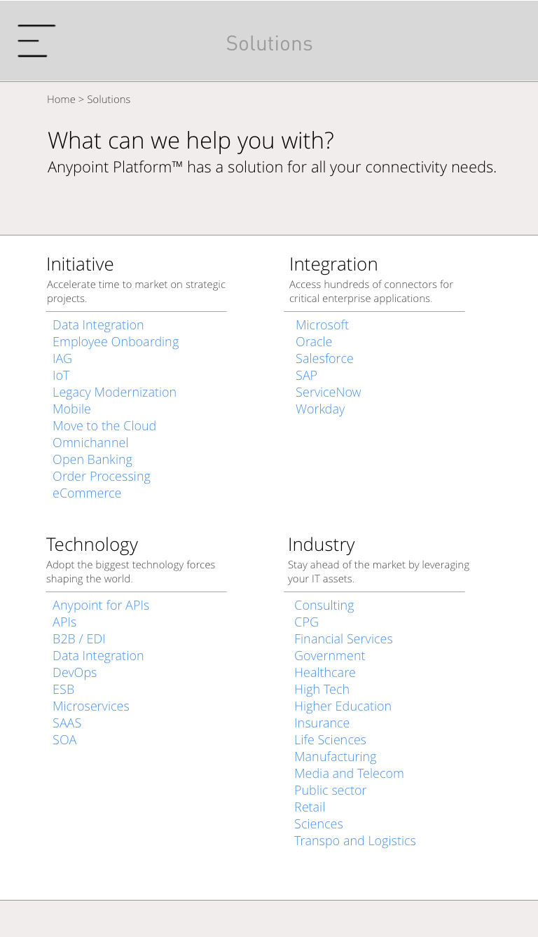
Mulesoft Solutions Page (tablet wireframe)