Summary
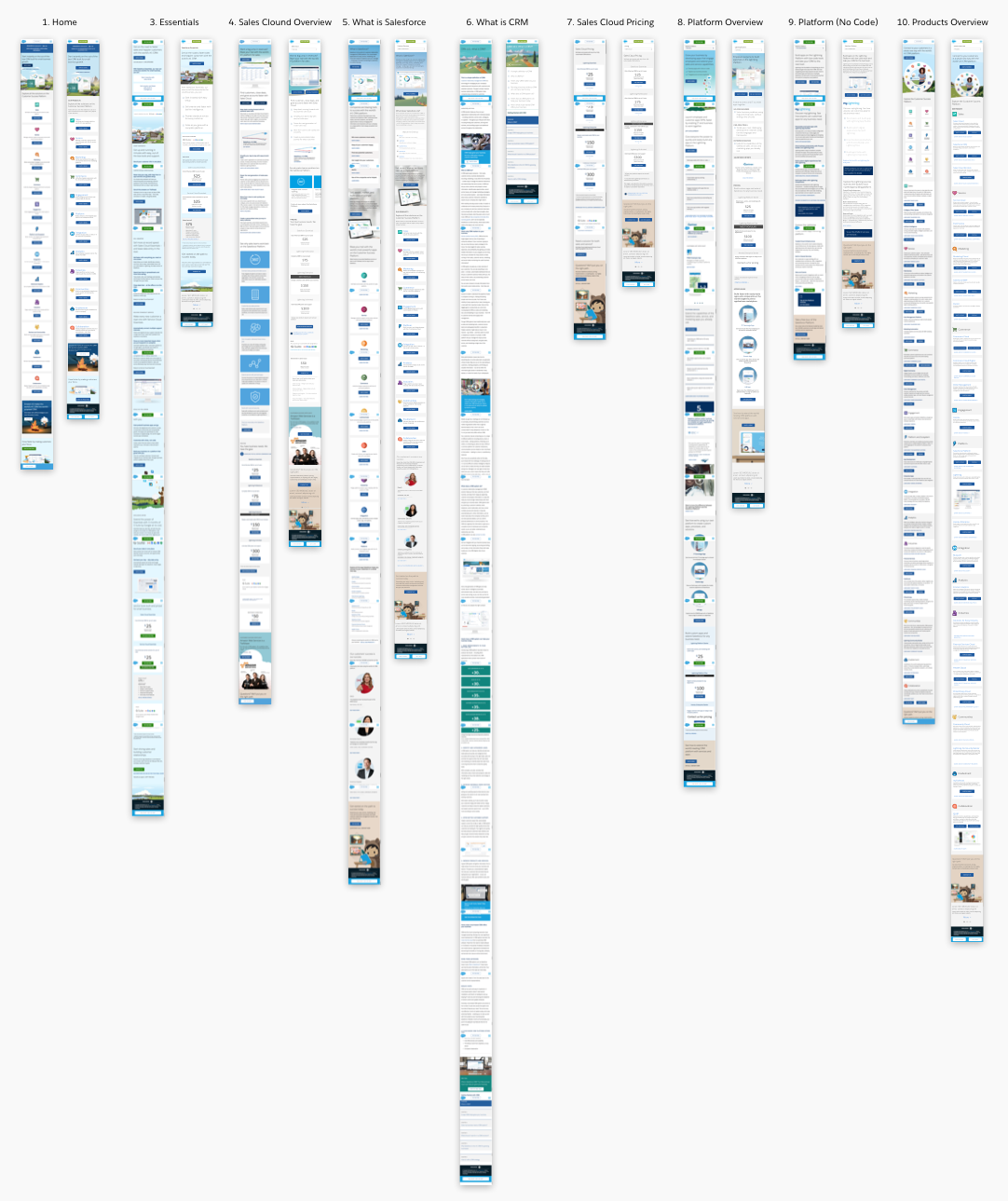
Salesforce.com was initially designed from a desktop first perspective. They wanted to take a look at their top 10 properties, and redesign them using a mobile first perspective.
Problem
Mobile web traffic had increased to over 20% to Salesforce.com’s top 10 pages in 2018, which included home, What is CRM, What is Salesforce, Products, etc to see if we could create and increase in overall conversion from the Try Free and Learn More buttons.
Solution
The marketing team and I looked at the Top 10 properties. Through analytics, and best practice solutions we performed a complex competitive analysis. We came up with wireframed prototypes which we tested against the current screens on mobile web. The testing was positive. We implemented the Top 3 initially, optimizing screens, removing redundant buttons (Try Free, Watch Video, Learn More). After implementation of the new designs, conversion went up. For What is CRM, we brought the length of the screen from 14,000 pixels to 1,500 pixels by using accordions.
Website/App